Redesigning Healthcare With Archetypes

I joined HealthSparq as the Director of User Experience in 2014 to find that the v1 product, that was soon to launch, did not entirely match up with our clients’ and users’ needs. And, that it didn’t really reflect the reality of the healthcare experience. What followed was an intensive three-year effort to research and rethink our design strategy, then reeducate the executive team and company at large about the new direction we needed to go.
I spent my time at HealthSparq evangelizing various experience-related agendas. The following is an example of one of these. I explain how we had to reinvent commonly used research techniques to get to the heart of what our users actually needed.
HealthSparq Archetypes
Healthcare insurance companies actually save money when patients have some sort of visibility into how much procedures cost, and can see the quality ratings and reviews of their doctors and surgeons. This was the prevailing philosophy behind HealthSparq – a healthcare transparency startup.
As the Director of User Experience I think perhaps one of the most significant strategies we invented to assist in this effort, was a unique set of archetypes that helped us all better understand the patients’ needs and steer the product to better support them.

The usual research techniques aren't enough
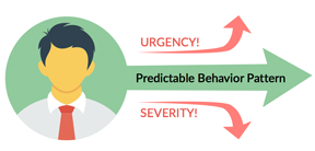
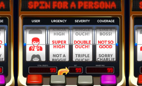
To get this effort started, I began by working with the UX & Research teams to build personas and journey maps of the current users and experience using the usual techniques. The result felt too inflexible and brittle. Personas should map out generalized predictable behavior patterns. However we found that these patterns became unpredictable when the urgency and severity of a health concern were combined with the income and level of health insurance coverage of the patient. Thus demolishing the value of that particular technique. To me it felt as though you needed to select too many variables to adequately define how a user might react to any given feature within the app. I likened it to a persona slot machine. If you pulled the lever, each wheel would define a potential variable condition and reaction a patient might have. It seemed clear that this was a wasted effort for the healthcare space. There were just too many options for this to be useful. We needed to define our users' needs in a different way.
I stepped away from demographics and looked at the underlying patterns of interaction with the healthcare industry and found three primary scenarios or journeys. This was far more useful and became the basis for how we classified the patients who used our application. We modeled our archetypes after these three primary patient journeys. Here is a brief explanation of each archetype.
Archetype 1 “ONE & DONE”
This type of patient just needs one interaction with a physician to resolve their concern. They might just require a flu shot or even a single exam regarding a sore throat. The primary take-away is that the experience is singular and brief.They need features that assist them in finding and establishing relationships with professionals who can offer the following long-term care:

Additionally, they need features that assist them in finding the following short-term products and services:

Archetype 2 “REPAIR & RECOVERY”
This patient type requires several interactions to resolve their health concern. Something like a broken ankle might require multiple visits with various, doctors, labs, surgeons, and physical therapists to resolve the injury.
They need features that assist them in finding professionals and services that will assist them with their recovery:

Additionally, they need features that guide them through and managing their journey to recovery:

Archetype 3 “CHRONIC CONDITIONS”
This patient suffers from a condition or ailment requiring recurring support and continual/consistent interactions with a physician to maintain their health.
They need features that help them find the following products and services to continually monitor and manage their condition:

Ok, so why are these archetypes significant? What understanding do they give us that we didn’t have before? Here’s what we learned.
1. Our existing product strategy was wrong!
The initial version of the application was intentionally aimed at tapping into the mental model and design that has become the standard online shopping experience. This model adequately supports our ONE & DONE archetype. As in, they buy something online and that’s it. They don’t need more than a single interaction to get what they need.The flaw in this strategy is that this approach, though familiar, does not match either the service pricing reality, nor the level or number of interactions often needed from healthcare as a service. It doesn’t meet everyone’s needs and limits the effectiveness and influence the product could have.
2. We were aiming at the wrong user type!
If our goal is to help everyone save money by helping people make smarter healthcare decisions, then we need to focus on supporting the patients who have the most decisions to make – namely the “REPAIR & RECOVERY” archetype.To correct this, the product needs to not only remember the user, but also what their ailment is, where the user is on their journey to recovery, and educate them on the options at each decision point. E.g. Should I get an MRI or x-ray? How much do they cost? Where can I get them? What is the advantage of one imaging technique over another?
3. We needed to offer a very different product to realize our vision!
The “CHRONIC CONDITIONS” archetype requires scheduling features to help them keep track of their prescriptions and recurring doctor visits. The “REPAIR & RECOVERY” archetype requires mapping and journey-related features in addition to the ability to review and select physicians based on experience, reviews, cost/coverage and distance. The “ONE & DONE” archetype needs features that focus on search tools, and a follow-up strategy to capture the result of their doctor visit. Potentially transitioning them over to the “REPAIR & RECOVERY” strategy if their issue turns out to be more serious than initially expected.Summary
In my opinion, this is a very good example of a product that was created without enough initial research. I inherited a product that promised to offer services and benefits that it could not support with its current market and feature strategy. My objectives as the leader of the UX team changed significantly after completing this assessment. I shifted my focus to educating the executive team on the results of their existing strategy. I started brainstorming and sketching out these new features to help the company understand what we could do, and where we should place our efforts to maximize our influence and value. I extended this effort by evangelizing our findings with the design and research leaders of our parent company who had been struggling with similar issues.Other topics of interest
Contact me if you’d like to hear more about other healthcare transparency topics. Some of these include:Healthcare Journey Mapping

We all love journey maps. Ok, well most of us do. However there are certain considerations when creating them for the digital healthcare space. Ask me for details and I'll tell you all about it.
SaaS-based Design Considerations

There are many things to consider when creating Cloud and SaaS-based design solutions. Ask me about B2B strategies for companies that use your app in B2C environments.
Searching for Doctors

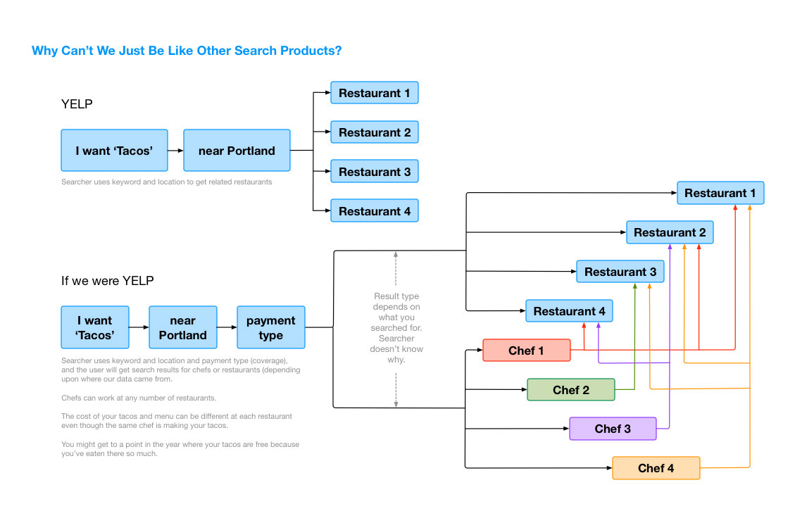
The factors contained in a doctor search are unlike anything else. It's different - very, very different than other search engines. Ask me about this and I'll show you why.