White Label Mobile Experience
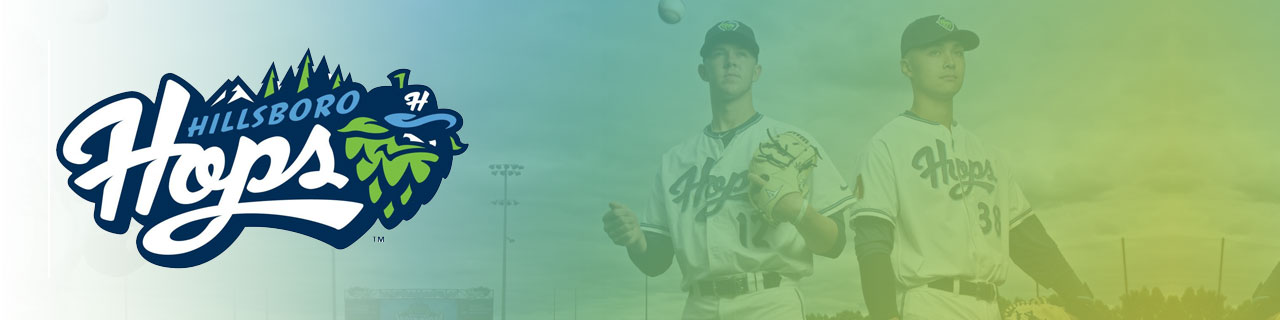
The primary goal of this project was to create a white label mobile platform for minor league teams that better supported fan engagement and offered the team control of their mobile experience. Our proof of concept was built with the partnership of The Hillsboro Hops, a local minor league baseball team – who just happen to be the 2019 league champions.
Getting Started
I met up with the general management of the team in April and walked them through a Reality Mapping session to help establish the boundaries and needs of the existing experience of going to a ball game. My goal here was to capture the full experience of attending a game and document all the steps or tasks that fans usually experience. Additionally, we captured any questions, concerns, and ideas the group had with each step.
Our results looked like this:

Defining user types
 As you can see from the photo above, I included a phased set of user types that I illustrated and named:
Fickle - Attends if invited, easilty distracted, unfamiliar with the park, the team, and possibly the game.
Frequent - Attends occasionally, a fan of other teams and sports, might own some swag, may have the team app installed.
and Fanatic - Attends regularly, knows the players, bring friends and family, buys team merchandise, watches the stats, evangelizes the team and game.
I've found lightweight archetypes based on projected product usage, experience, jobs to be done or other similar attributes to be easier for teammates and clients to understand and adopt when working on projects like this. The Hops team found them to be accurate and easy to remember. They became a natural part of our discussions, and eventually our prevailing goal was to build an app that would help to turn Fickle attendees into Frequents, and Frequents into Fanatics. It was a simple laddering approach that successfully aligned the team.
Turning Our Research Into Features
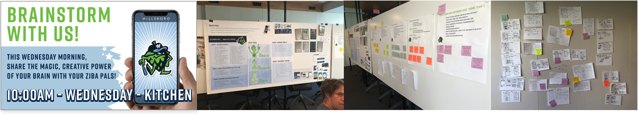

Our reality mapping session results yielded a ton of great feature ideas. Additionally, I got the studio together for a brainstorming session to look for areas ripe for innovation.
All of this quickly took shape into a list of features that I grouped and prioritized into an MVP plan that I shared with the management team.
Sketches
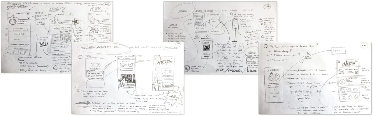
I started the design phase by sketching out my thoughts and ideas for what each v1 feature might offer. I was not overly concerned with perfection. My main goal here was just to get the ideas out and document anything that might become an issue to watch out for later on.
Scenarios and Task Flows
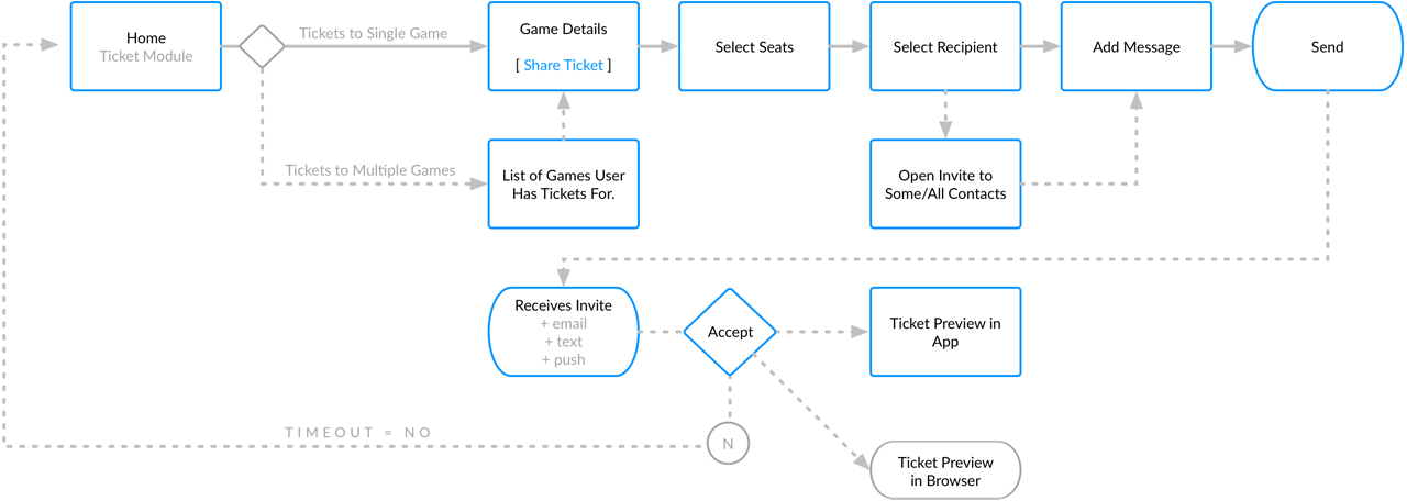
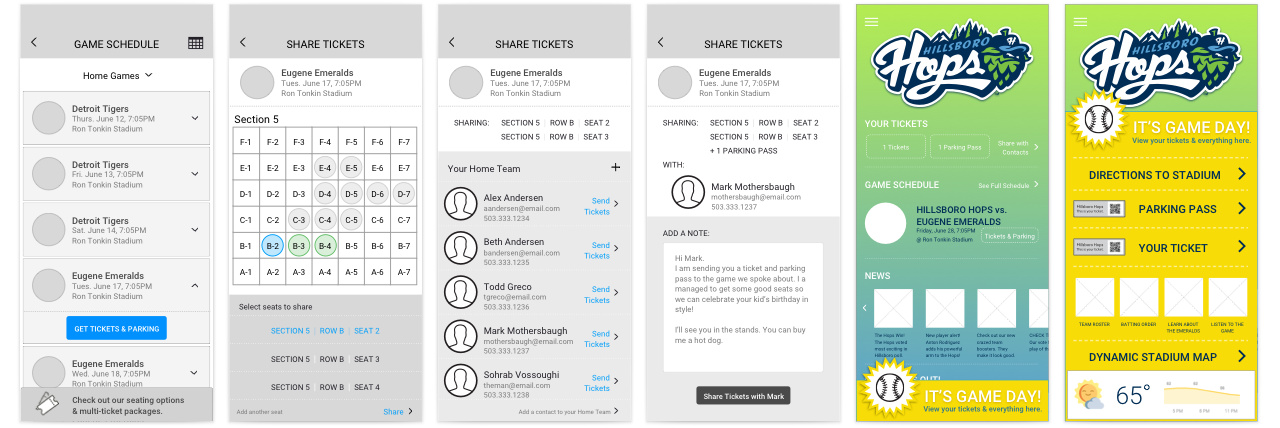
After having some idea of what each feature might entail, I created three primary task flow scenarios that I used to weave most of the v1 features into a single story. I plotted these scenarios/stories into simple workflows. These eventually became the basis of the final v1 prototype. This example explains the steps required to create a friends and family list to share tickets with.
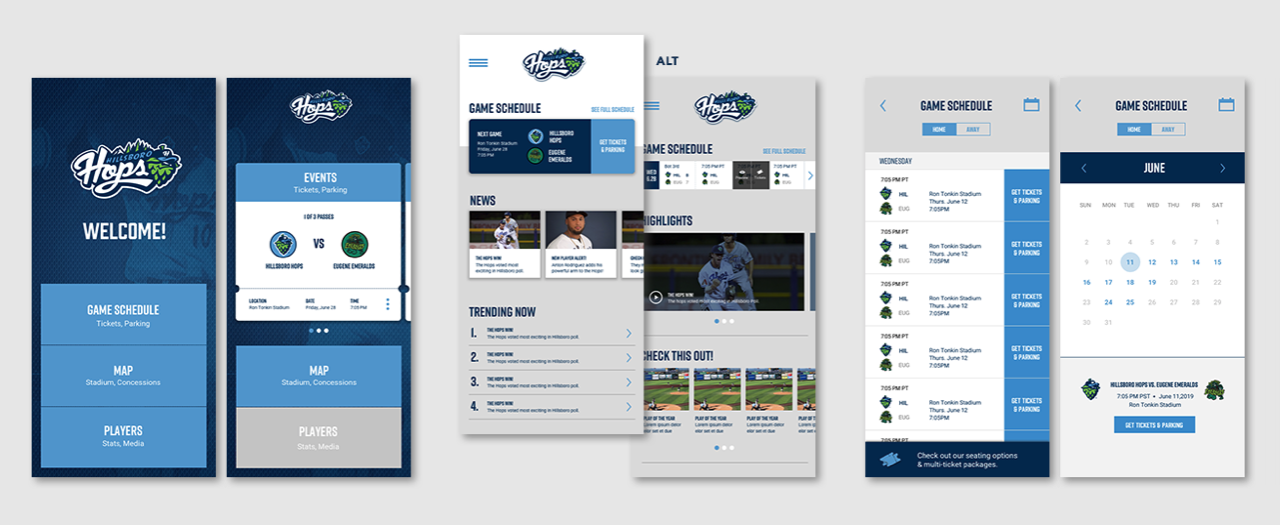
Wireframes
All of that work evolved into wireframing loose explorations of the varying solutions and states each screen might require. These became progressively more polished as I continued to add detail and content.
Visual Design
The Hops team had a very well documented style guide that we leveraged for the mobile app. That said, this is intended to be a customizable white label app. So, we applied the visual style in a controlled manner that would allow for other teams to customize the app to meet their branding and style needs as well.
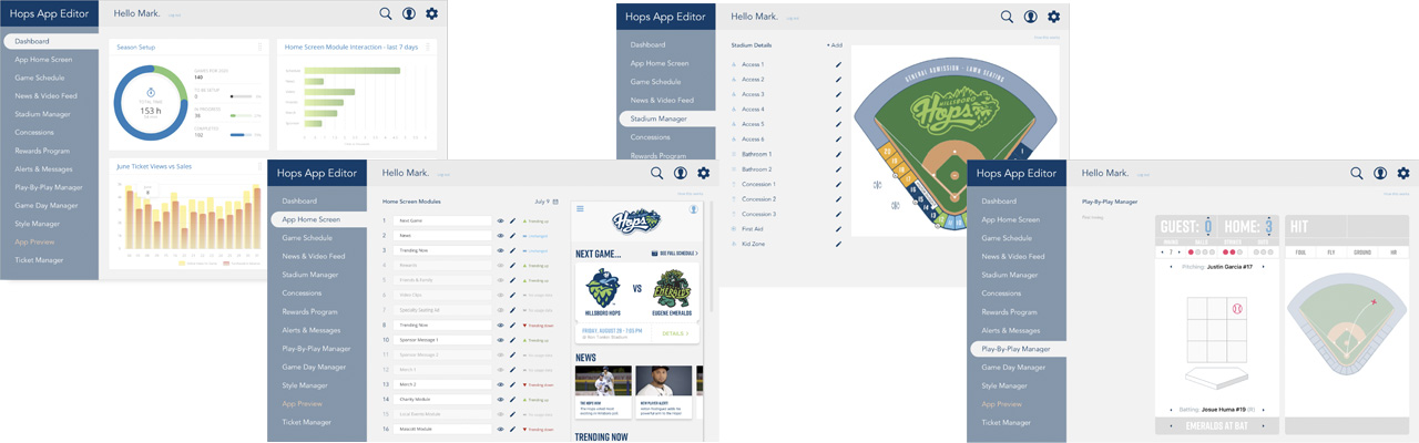
Client Portal
Finally, I designed a white label portal the team management could use to manage the content of the app. This included: home page marketing, concession menus, maps of the stadium and much more...)
Please contact me if you would like to hear more about this project or view the larger prototype.